The rules of composition are not necessarily hard and fast. They serve as guides only, much like lined paper does for writing straight sentences. Photography is a graphic medium. Much like painting, an image is typically created on a two-dimensional surface bordered on four sides. This working surface is the tabula rasa. The instant a mark is placed on the flat surface a composition begins by relating the mark and its position to the four sides of the picture frame. As more marks are added to the surface, they begin to relate to one another as well as to the four sides of the frame. Control over the placement of elements and their relationships within the framed border can convey specific meanings to the viewer, much like the structure and inflection of language.
This blog discussion only addresses one aspect of composition, namely graphic composition. There are many other elements to composition -- color, and shape to name a couple. I will come back to these in a later blog posts.
Graphic composition, like music, is recognized as pleasing and meaningful to the human mind by the harmony -- or dis-harmony -- of its elements. Over thousands of years we have contrived conventions for dealing with the division of graphic space. The most basic of these is the grid, and the most basic grid is a single rectangular space bordered on four sides. We expand the grid by sub-dividing the space into evenly separated elements.
One of the oldest rules of graphic composition is the rule of thirds. It is when a rectangular space is evenly divided by two horizontal and two vertical lines, and is derived from the popular format of 35mm film, which is 24x36mm, or 2:3.
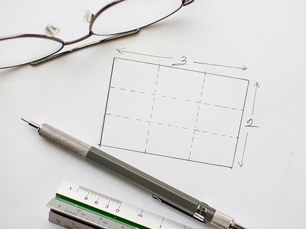 |
| The 35mm frame has a 2:3 proportion. The illustration above shows it divided evenly into a grid of three parts horizontally and vertically. |
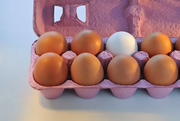 |
| The placement of the carton of eggs within this photograph follows the graphic grid of the rule of thirds composition. The edges of the egg carton are aligned with the two horizontal lines, while the white egg has been placed on the axis point of two of the intersecting lines |
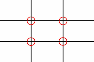 |
| The grid pattern above is overlaid on the photo below. |
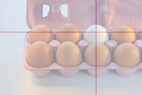 |
| Overlaying the red lines demonstrates how closely the composition aligns with the grid of thirds. Intuitively, the mind will recognize this underlying pattern as it seeks a visual order to the placement of the elements. This instinctive discovery is similar to the recognition of harmony when listening to music. |
The rule of thirds grid is loosely based on one of the oldest harmonious grid structures called the Golden Section. The Golden Section refers first to a line that is divided so that the ratio of the two parts is 8:5. A Golden Rectangle has its sides in the same ratio, and when the rectangle is evenly divided with a grid that corresponds to this ratio it forms a series of evenly spaced, square boxes. Aligning our composition within the structure of this grid so that the lines coincide with the grid lines and objects are place on intersecting points appears naturally pleasing to the eye.
Of course "naturally pleasing" may not be the intended message the photographer is seeking to present, in which case objects and lines of composition may be intentionally placed outside the grid positions to create a feeling of discord in the viewer. In either case, working with the grid or against it, the placement relative to the intuitive grid relays a message to the viewer.
The rule of thirds grid suggests the use of an asymmetrical composition, but compositions can be symmetrical also. For these we need to work with more symmetrical grids.
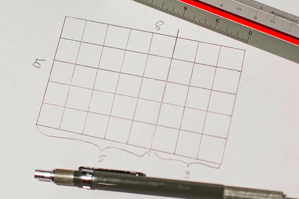 |
| The grid drawn above, a Golden Section, is based upon a proportion of 8:5, a visual harmony that has been recognized for many years. The Greeks applied this divine ratio to the rectangular structure of temples, such as the Parthenon. |
One of the simplest uses of a grid is for placement of the horizon line. Low placement gives more emphasis to the top portion of the image, while high placement does the opposite. Placing the horizon line right in the middle does not emphasize one side over the other.
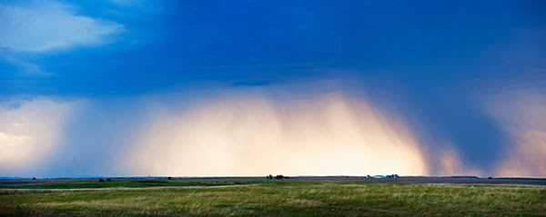 |
| This very obvious placement on the lowest part of the grid allows the stormy sky to dominate the image, which in turn delivers a message about the vastness of the scene. |
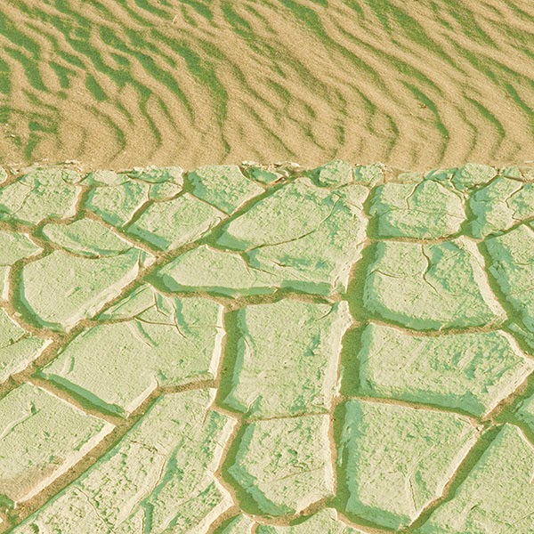 |
| With the main dividing line (It doesn't have to be a real horizon.) placed on the top third grid line, visual emphasis is given to the cracked earth on the bottom. The sand lets me know I'm looking at a desert scene, but the large area of cracked earth tells me the story of the parched dryness of the place, which is the main theme of the photo. |
The most important thing to keep in mind about composition is an awareness and use of the entire picture frame to tell the story. Most beginners place their subject in the middle of the frame with little regard for the surrounding area that completes the picture. The complete frame should be used to tell the story. Skill is needed to establish not only the relationship of the objects within the frame but, just as importantly, the relationship of the objects to the overall frame itself. An element introduced into the picture frame and not helping the main subject or idea, is hurting it instead. What is included is important. Where it is included and what relationship it has to everything else in the frame is crucial to good composition.
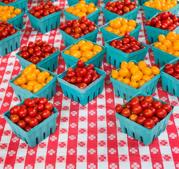 |
| Here the objects are placed directly on an understood grid, their relationship to each other emphasizes the pattern. The design of the tablecloth adds to it, the shape and placement of each carton of tomatoes also sits on the grid, and a square format becomse the obvious choice for the containing picture frame. This picture could have been taken tilted off to one side or the other, but that would have been just a shot of tomatoes. Instead the objects were aligned deliberately based on a grid mentally imposed over the scene and the rhythm created by this grid becomes the main theme of the photograph. |
 |
| This is a situation where purposeful symmetrical placement of the object is meant to illustrate the inherent beauty of symmetry in nature. |
The thing to keep in mind is that the instant we decide upon a shape for our picture frame we are working with a grid. Sub-dividing this frame further provides a more organized surface area that can be used to tell our story.
Although I presented two of the more popular grids in graphic composition, they are not the only ones available. For most purposes, simply subdividing the area proportionately is and creating an incremented grid relative to the proportions is sufficient. Most of the grids used below follow that principle.
Below are some uses of grid based compositions:
I always worked with a grid screen in my cameras. Today it is even easier, since most modern cameras come with built-in grid lines that can be lit up and superimposed over the viewfinder frame.
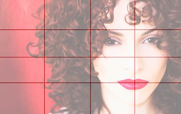 |
| I published this image on my blog just a few days ago and am including it here to demonstrate that a grid layout can work even with a portrait. |
There are a number of tools of composition that can help guide the eye and aid in telling the story and delivering the meaning the creator intends.
The human mind seeks patterns in a graphic display, and is constantly in search of order and meaning in this visual realm. Graphic artists know this and utilize grids as roadmaps that guide the viewer through the image and elicit a response to the visual stimuli created by the harmony or dis-harmony of alignment with this grid. That is the essence of graphic composition and one of the many tools photographers have at their disposal in creating images.
A subject plopped without thought in the middle of a picture is a blob devoid of meaning. The same subject, thoughtfully scaled, and place in relation to other objects within the frame and relative to the frame itself so it is infused with meaning is graphic composition.




Excellent post and a terrific supplement to your book. So if you increase the grid size format to include "square" such as the 5X8, this helps more with symmetrical composition as it is not divided into 3rds? I'll check your blog and book to understand this further. I use the rule of the 3rds a lot for my blog when creating an image for a titled post. My blog focuses on the art of drawing and there are so many parallels to photography that I find it fascinating! I simply love this process but want to hone this skill more so that there is more interest and artistry behind the images for my blog. Thanks so much for sharing your craft with us.
ReplyDeleteThe idea that the Greeks used Gold Section is a myth:
ReplyDeletehttps://www.maa.org/external_archive/devlin/devlin_05_07.html